shadcn/ui design system file
shadcn/ui DESIGN.md for AI coding agents
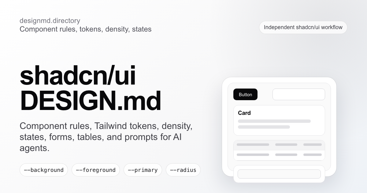
A practical design contract for agents using shadcn/ui. It defines component rules, Tailwind tokens, density, states, forms, tables, dashboards, and prompt-ready constraints.
Why it matters
Why shadcn/ui needs DESIGN.md
A reference file gives the agent durable decisions to apply — and a boundary for what to avoid.
Components
01shadcn/ui gives teams component ownership: Button, Card, Dialog, Table, Badge, Form, Select, and Tabs live in the repo instead of a black-box package.
Product taste
02DESIGN.md gives those components product taste: density, hierarchy, variant rules, token meaning, empty states, error states, focus states, and anti-patterns.
Agent consistency
03Agents need both. Without a DESIGN.md file, they can use the correct shadcn primitive while still composing a generic dashboard.
Scope
04The reference is intentionally independent. It points agents to official shadcn docs for installation and to local DESIGN.md rules for product-specific decisions.
Color System
Brand palette extracted from the design system. Click any swatch to copy the hex value.
Text / Primary
#101828
Accent
#e11d48
Surface / Background
#fff1f2
Border / Subtle
#fda4af
Typography Specimen
Display
2.8rem / 700 / 1.04
The quick brown fox
Heading H1
2rem / 700 / 1.1
The quick brown fox jumps
Heading H2
1.5rem / 600 / 1.15
The quick brown fox jumps over
Heading H3
1.125rem / 600 / 1.2
The quick brown fox jumps over the lazy
Body
1rem / 400 / 1.5
The quick brown fox jumps over the lazy dog
Small / Caption
0.75rem / 400 / 1.5
The quick brown fox jumps over the lazy dog and sat down.
Monospace
const primary = "System";
Layout & Spacing Tokens
Spacing Scale
Border Radius
Elevation & Shadow
Raw DESIGN.md File
The full source file in Markdown format, plus export variants for Tailwind config, CSS variables, and design tokens. Sign in to copy or download the full file.
# shadcn/ui DESIGN.md
## Product feel
A practical design contract for AI agents using shadcn/ui: component rules, Tailwind tokens, density, states, forms, tables, dashboards, and prompt-ready constraints.
Build for a Vercel-style, Monochrome UI, Devtool visual taste. Keep density practical, typography strong, and layouts easy for AI agents to repeat.
## Color direction
- Primary text: #101828
- Accent / interactive: #e11d48
- Surface: #fff1f2
- Border / separators: #fda4af
## Typography
- Use a modern sans for body copy and a sharper display face for hero/page titles.
- Titles should feel deliberate, not shouty. Avoid oversized marketing fluff.
- Meta text should stay compact and quiet.
## Layout rules
- Prefer light UI by default.
- Use compact spacing and card grids that still feel breathable.
- Keep navigation practical: search first, then filters, then actions.
- This entry belongs to the "design-creative" lane.
## Components
- Buttons: slightly rounded, clear hierarchy, only one primary CTA per section.
- Cards: soft border, useful metadata, preview-first composition.
- Empty states: helpful, never dead.
- Code panels: mono, dense, copy-friendly.
## Agent rules
- Do not generate generic Tailwind marketing blocks.
- Respect the palette and keep component states consistent.
- Optimize for these tools: Cursor, Claude Code, Codex, Google Stitch.
## Accessibility
- Preserve contrast for text and controls.
- Use visible focus states.
- Avoid relying on color alone for meaning.
## License
Reference only
AI-agent workflow
Read DESIGN.md with AGENTS.md before editing UI. Preserve local imports, responsive behavior, and accessibility.
Related pages and guides
7 references
STARTER
shadcn/ui DESIGN.md starter
A starter file for installed components, variants, density, and UI states.
GUIDE
DESIGN.md for shadcn/ui guide
The educational guide for writing shadcn-specific design memory.
REFERENCE
Tailwind CSS DESIGN.md
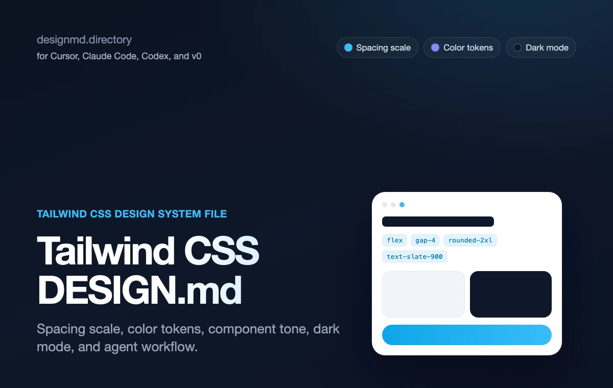
The primary Tailwind CSS reference: spacing scale, color tokens, and component tone for AI agents.
TEMPLATE
Tailwind DESIGN.md template
A companion template for CSS variables, spacing, and component tone.
WORKFLOW
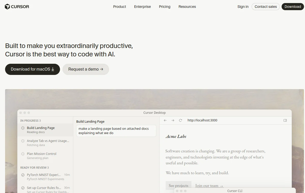
Cursor DESIGN.md
A related agent workflow page for applying shadcn/ui rules in Cursor.
REFERENCE
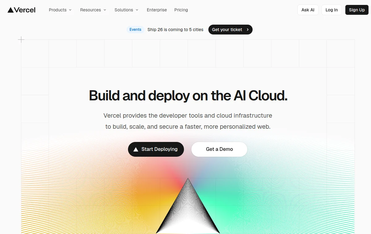
Vercel DESIGN.md
A related devtool reference for monochrome AI-built interfaces.
WORKFLOW
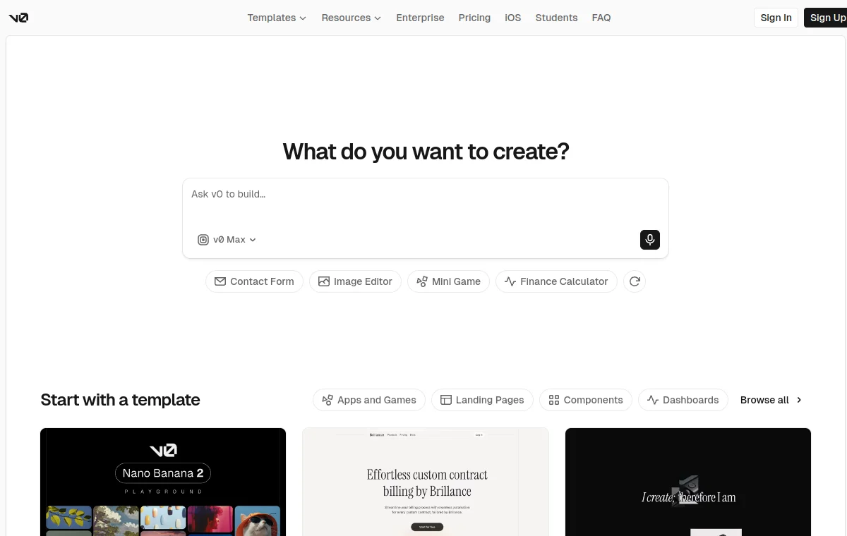
v0 DESIGN.md
A related workflow page for generated React, Tailwind, and shadcn UI.
Related shadcn, Tailwind, Cursor, Vercel, and v0 pages
shadcn/ui DESIGN.md starter
Practical starter rules for AI agents building shadcn dashboards, forms, and tables.
DESIGN.md for Tailwind
Use Tailwind token language inside DESIGN.md without sounding vague.
Tailwind DESIGN.md template
A template style file for Tailwind apps: color tokens, radius, spacing, shadows, and component tone.
Vercel
Vercel design system as a DESIGN.md — monochrome Geist UI, electric-blue accent.
FAQ
What is shadcn/ui DESIGN.md?
It is an independent markdown reference that tells AI coding agents how to use shadcn-style components with product-specific rules for tokens, density, component variants, forms, tables, dialogs, states, and dashboard composition.
Is this official shadcn/ui documentation?
No. This is an independent DesignMD reference for AI-agent workflows. Use the official shadcn/ui documentation for installation and component API details.
How do I use it with Cursor?
Copy the DESIGN.md file into your project, point Cursor at it before UI work, then ask Cursor to reuse existing shadcn components and follow the documented tokens, variants, density, and state rules.
How do I use it with Codex?
Put the DESIGN.md file beside your repository instructions and tell Codex to read it before editing UI. Codex should check the local component inventory, reuse existing primitives, and verify responsive, hover, active, disabled, loading, empty, and error states.
Does it work with Tailwind?
Yes. The reference uses shadcn/ui and Tailwind token language, including CSS variables such as --background, --foreground, --card, --border, --primary, and --radius as starter examples.
Should I use this or the starter page?
Use this reference page to understand the full workflow and component rules. Use the starter page when you want a shorter file scaffold to adapt inside an existing shadcn/ui project.